


We all know how important a good night’s sleep is for our health and wellbeing, but did you know that the colours you use in your bedroom could be affecting how well you rest? It turns out that your bedroom colour palette may play a bigger role in your sleep quality than you might expect.
At Jones Clocks, we believe your bedroom should be a calming sanctuary, and choosing the right colours is a big part of creating that restful environment. Let’s explore which shades are best for promoting deep, restorative sleep, and how to style them with the perfect bedroom clocks and alarm clocks…
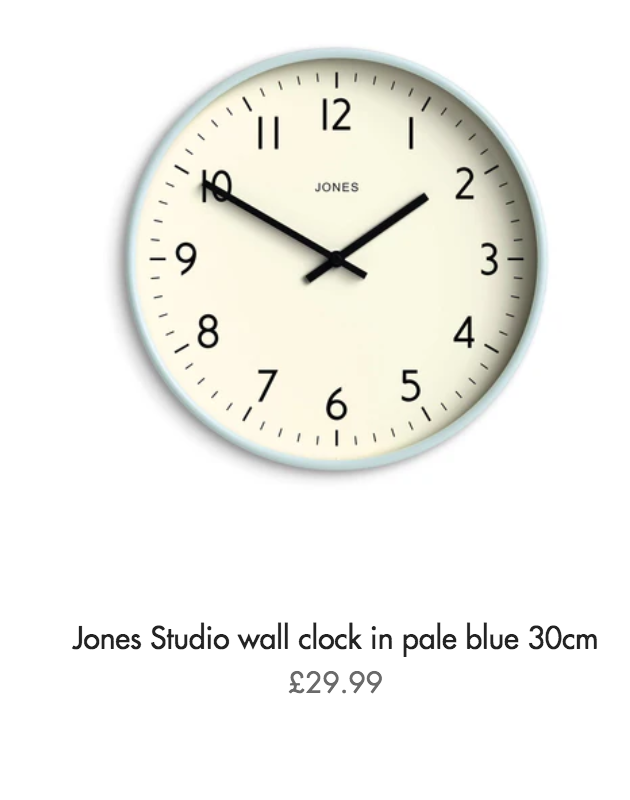
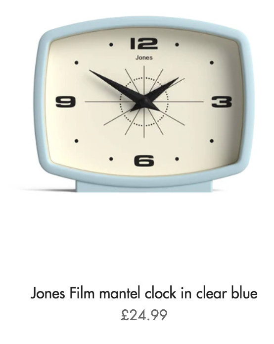
Blue: the calming classic
If there’s one colour that all sleep experts agree on, it’s blue. Soft, muted blues- like powder blue, mist, or chambray- are renowned for their calming effect on the mind. Psychologically, blue is associated with tranquillity and relaxation, helping to lower blood pressure and reduce feelings of anxiety. It’s a brilliant choice for bedrooms where sleep is a priority. Pair with white or grey accents and simple furnishings for a clean, serene aesthetic.
Ideal bedroom clocks and alarm clocks to match with blue…
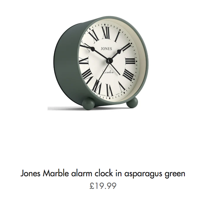
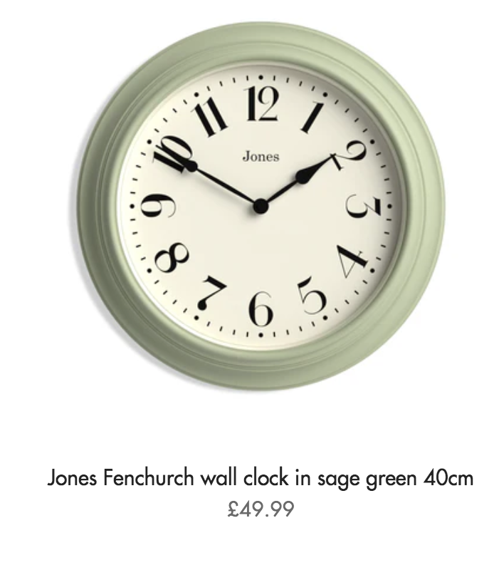
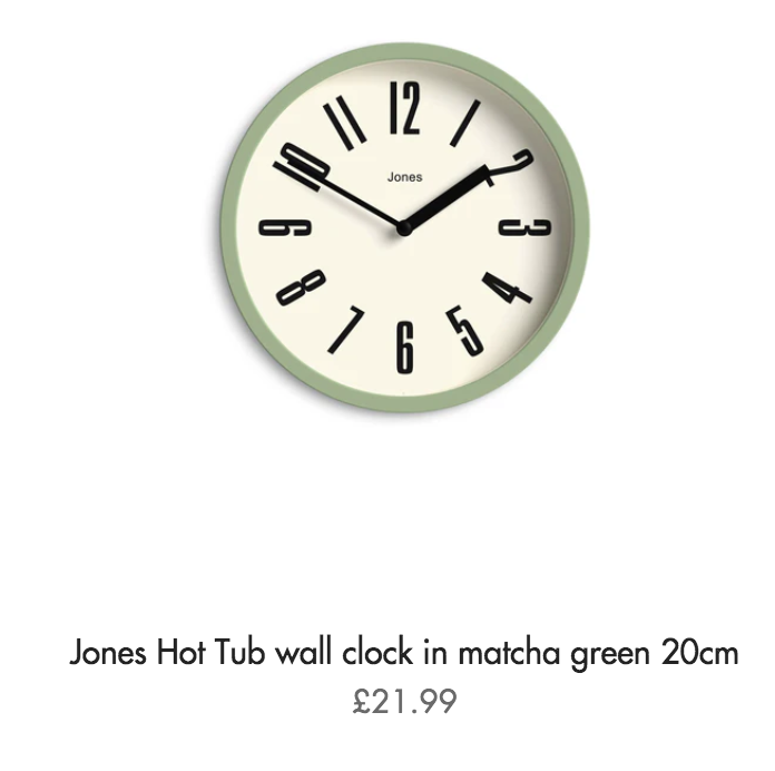
Green: a natural choice
Green, especially sage or asparagus tones, brings a touch of nature indoors and helps to create a peaceful, grounded atmosphere. Earthy greens work well with natural materials like linen, rattan and wood, encouraging that indoor-outdoor connection that supports relaxation. Combine with layered textures and warm neutrals for a cosy yet refreshing bedroom feel.
Ideal bedroom clocks and alarm clocks to match with green…
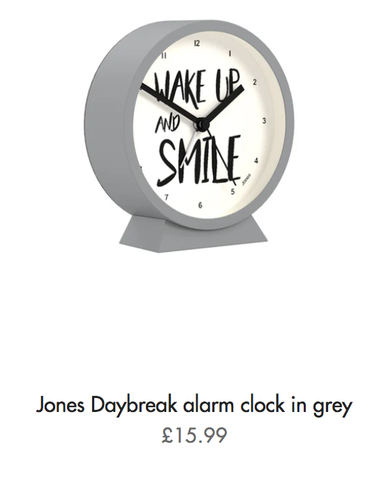
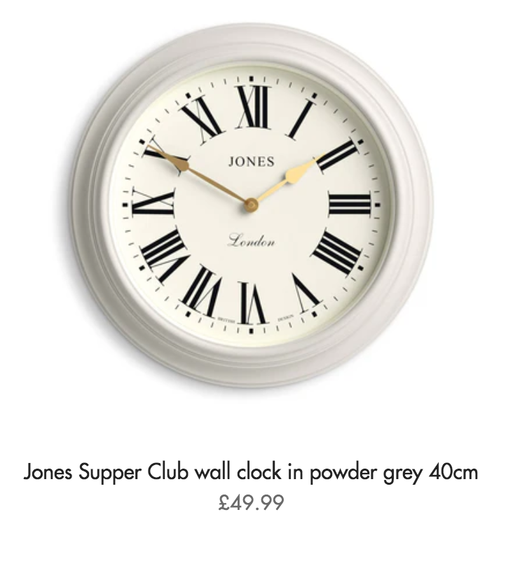
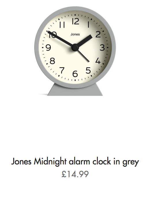
Neutrals: soft and soothing
Creams, taupes, warm greys, and soft browns create a gentle, cocooning space that doesn’t overstimulate the senses. These colours make a great backdrop for layering textiles and personal touches. They’re also extremely versatile, perfect if you like to change up your bedroom decor seasonally. A well chosen neutral colour palette can instantly make a space feel more restful.
Ideal bedroom clocks and alarm clocks to match with neutrals…
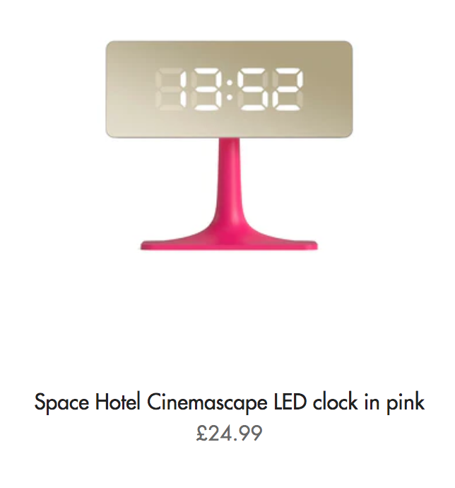
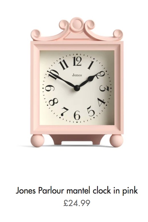
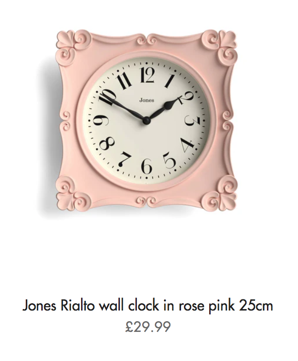
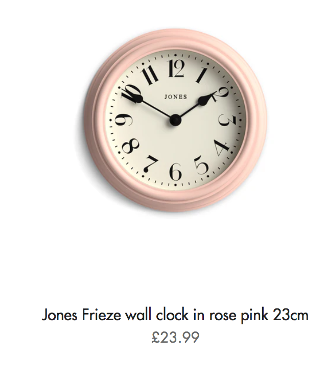
Pink: surprisingly soothing
While it may seem unexpected, soft blush pinks or muted rose tones can be surprisingly soothing in a bedroom setting. These gentle hues bring warmth and subtle charm, without the intensity of red or orange. Pair with dusky greys, warm woods and brushed brass for a grown up take on a feminine palette.
Ideal bedroom clocks and alarm clocks to match with pink…
Bedroom clocks and alarm clocks: your finishing touch
Once you've chosen your ideal colour palette, don’t forget the details. Soft lighting, natural textures and well placed accessories all help to enhance a sleep-friendly atmosphere. A stylish clock in a matching shade can add that final touch. And of course, don’t forget alarm clocks: you may be sleeping so well in your carefully-chosen colour scheme that you find it hard to wake up! An alarm clock that tones in perfectly with your colour scheme makes the ideal accessory.
Colours to avoid…
While vibrant colours like red, orange, and bright yellow might be energising during the day, they’re best avoided in bedrooms. These shades can increase heart rate and alertness: not ideal when you're trying to unwind. Also, very dark colours should be avoided as they can feel overpowering, disrupting the restful ambience.
Creating a restful bedroom isn’t just about good furniture: it’s about creating a space that soothes your senses. With the right colours, textures, and accessories, you can design a space that not only looks beautiful, but helps you drift off into a peaceful night’s sleep.


